
H2 Economics (9570) calls on about fourteen core diagrams, which this atlas covers from the production possibility curve to the Lorenz curve (public goods are explained in words), and each one earns marks only when its axes are named, any before-and-after equilibria are labelled and the text refers to it. Ancourage Academy practises diagram construction in its JC1 H2 Economics classes and the wider JC Economics programme, because the syllabus names topics but does not show how to draw them. This guide sets out every diagram as text: what goes on each axis, which curves to draw, what shifts, which areas to shade, and which question each one answers. For the paper structure and themes, start with the H2 Economics 9570 guide. For how a diagram fits into an essay or case study answer, see the essay and CSQ technique guide.
Ancourage Academy's JC1 H2 Economics classes run in small groups of 3 to 6; book a trial class (usually $18) to start with a diagnostic of where your child stands.
What Does the 9570 Syllabus Actually Say About Diagrams?
The 2027 syllabus names only a few diagrams outright, including the PPC, the two externality diagrams, the tariff diagram and the Lorenz curve. For the rest, the content it lists (shifts, surpluses, deadweight loss, AD and AS) is analysed with standard diagrams, and it also names several diagrams you do not need.
The syllabus, published by the Singapore Examinations and Assessment Board (SEAB) for 2027 school candidates, sets out assessment objective AO2 as the ability to "Interpret economic information presented in textual, numerical or graphical form." Paper 1 tests graph reading through "two to three pages of data presented in textual, numerical or graphical form"; graph drawing is how you answer.
Paper 1 (Case Studies) is two compulsory case studies, 60 marks (40%), 2 hours 30 minutes. Paper 2 (Essays) is three of six essays, at least one micro (Section A) and one macro (Section B), 75 marks (60%), 2 hours 30 minutes, each essay split into a 10-mark part (a) and a 15-mark part (b).
H1 Economics (8843) is examined through one case-study paper only, and its 2027 syllabus carries the same "two-diagram approach" note on externalities, so the two externality rows below apply to H1 students as well.
Which Diagrams Does H2 Economics Need? The Atlas
Fifteen entries cover the 9570 syllabus: ten micro, four macro and international, and one topic, public goods, that has no diagram at all. The last column shows whether the syllabus names the diagram itself or only the content the diagram is used to explain.
| Diagram | Axes (vertical / horizontal) | Curves and labels | What to show and shade | Syllabus basis |
|---|---|---|---|---|
| 1. Production possibility curve (PPC) | Good A / Good B | Concave PPC; point inside marked U, points on the curve marked A and B | Movement along the curve = opportunity cost. A point inside = unemployment or under-use of resources. An outward shift = more productive capacity | Named (1.1.1e) |
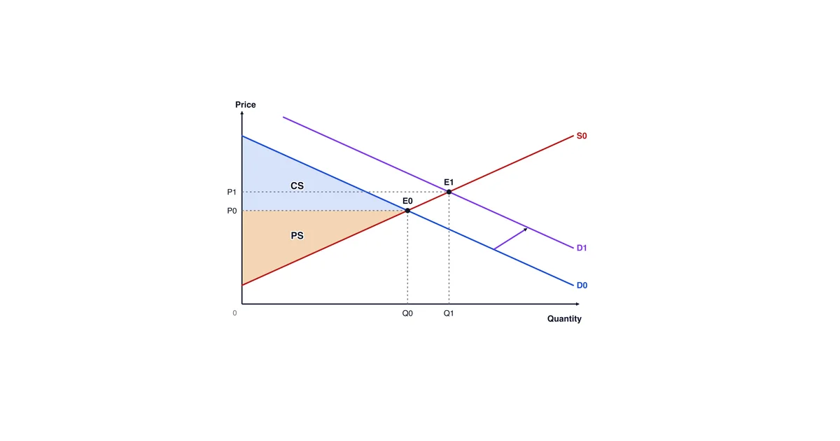
| 2. Demand and supply | Price / Quantity | D0, D1, S0, S1; equilibria E0 and E1 at P0/Q0 and P1/Q1 | Arrow on the curve that shifts. Label consumer surplus (area above price, below D) and producer surplus (area below price, above S) at the initial equilibrium; if the question asks who gains, letter the change at the new one as well | Content (2.1.2c to f) |
| 3. Elasticity (price elasticity of demand and supply, PED and PES) | Price / Quantity | A steep and a gentle demand or supply curve, each labelled with its elasticity | Draw the same shift against both. The price change is large against an inelastic curve and small against an elastic one. Compare expenditure (P times Q) before and after; in your own answer, shade the two rectangles | Content (2.1.2g) |
| 4. Price controls | Price / Quantity | D, S, equilibrium E; a horizontal line labelled Pmax below E or Pmin above E | Maximum price: shortage from Qs to Qd. Minimum price: surplus from Qd to Qs. In the labour market, a minimum wage shows a surplus of labour | Content (2.1.3a) |
| 5. Quota | Price / Quantity | D, S, and a vertical line labelled quota at Qq, left of Q0 | Price rises from P0 to P1 where the quota line meets D. Shade the lost surplus between D and S from Qq to Q0 | Content (2.1.3a) |
| 6. Indirect tax or subsidy | Price / Quantity | S0 and S1 (a tax moves S up by the amount per unit; a subsidy moves S down), D; E0 and E1 | The new price and quantity, and the change in expenditure, revenue and surpluses. Splitting the tax burden (incidence) is not required | Content (2.1.3a to c) |
| 7. Negative externality | Costs and benefits / Output | MPB = MSB, MPC, and MSC above MPC. Market output Qm, social optimum Qs | The gap between MSC and MPC is the marginal external cost. Shade the deadweight loss: the triangle between MSC and MSB from Qs to Qm | Named (2.3.2 note) |
| 8. Positive externality | Costs and benefits / Output | MPC = MSC, MPB, and MSB above MPB. Qm, Qs | The gap between MSB and MPB is the marginal external benefit. Shade the deadweight loss: the triangle between MSB and MSC from Qm to Qs | Named (2.3.2 note) |
| 9. Public goods | None | None | Explain in words: non-rivalry and non-excludability lead to non-provision | Content (2.3.2b) |
| 10. Profit-maximising firm | Cost and revenue / Output | MC, AC, AR (= D), MR; output Q* where MC = MR with MC rising | Price read off AR at Q*. The profit rectangle lies between AR and AC at Q* | Content (2.2.1a) |
| 11. Long-run average cost | Average cost / Output | U-shaped LRAC | Falling section = internal economies of scale; rising section = diseconomies. External economies move the whole LRAC down | Content (2.2.2b) |
| 12. AD/AS, with the multiplier | General price level / Real national output | AD0, AD0 + ΔJ (dashed), AD1, AS; E0 and E1 at Y0/Y1 and P0/P1 | An arrow on AD. Mark the injection ΔJ (the dashed AD0 + ΔJ) and the multiplied shift of AD, k × ΔJ, from AD0 to AD1; the rise in real output Y0 to Y1 is smaller because the price level rises. For cost-push inflation, shift AS instead | Content (3.1.2a to e) |
| 13. Exchange rate (SGD) | Price of SGD in foreign currency / Quantity of SGD | D for SGD (exports, inflows), S of SGD (imports, outflows); E0 and E1 | The rate rises (appreciation) or falls, and the diagram names the flow that caused it | Content (3.2.3b) |
| 14. Tariff | Price / Quantity | Domestic D and S; horizontal world price Pw; Pw + t after the tariff | Imports shrink. Shade the government revenue rectangle and the two deadweight-loss triangles (production and consumption) | Named (3.3.1d) |
| 15. Lorenz curve | Cumulative % of income / Cumulative % of population | 45-degree line of equality, and the Lorenz curve below it | A larger gap between the two means a Gini coefficient closer to 1 | Named (3.2.1 note) |
The words for the shaded areas matter as much as the shapes. Deadweight loss is defined in the syllabus as "the reduction in net benefit to society when output level is not at the social optimum". So in both externality rows the triangle sits between market output and the social optimum. The worked version, with a dataset, is in the market failure worked CSQ and essay. The elasticity rows are worked through with numbers in the elasticity calculations guide.
What Do the 14 Diagrams Look Like?
Each figure below is drawn to the atlas's own six rules wherever a rule applies (some figures, such as the price-control, firm and Lorenz diagrams, have no before-and-after pair, and others compare the points their own model calls for): a title naming the event (in an exam answer, name the market too), both axes named in full, every curve labelled, a before-and-after pair of equilibria with dotted lines to both axes, an arrow on any curve that shifts, and a lettered area for any welfare change. They are illustrative and not to scale; the shapes, labels and shaded areas are what an examiner looks for, and the numbering follows the atlas table (row 9, public goods, has no diagram).


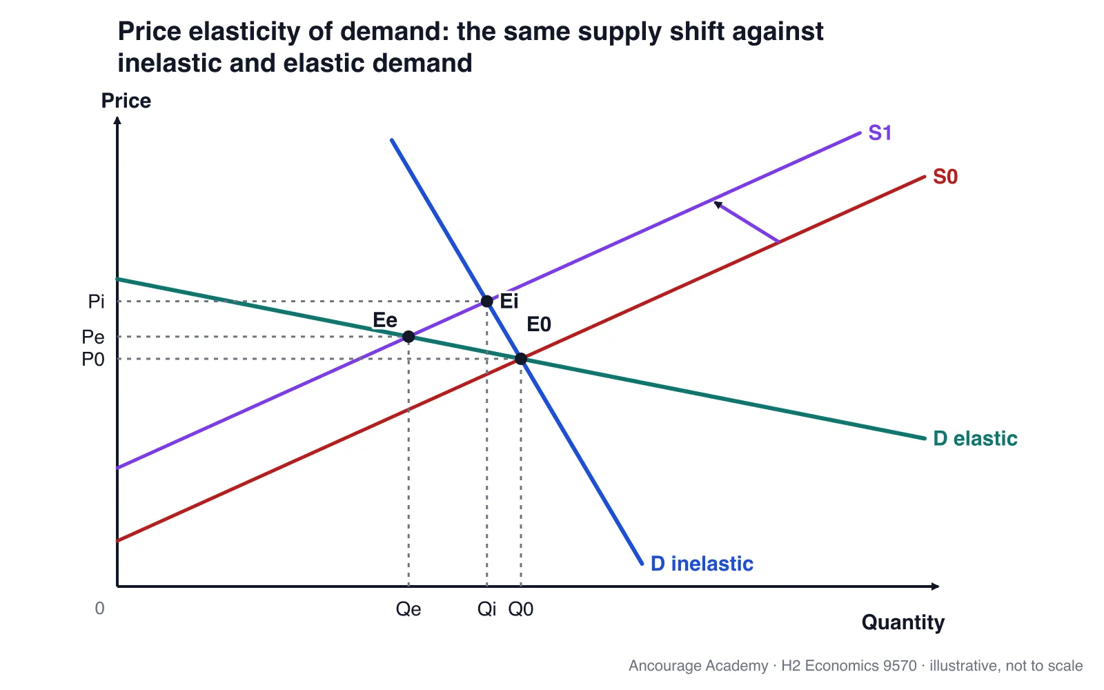


Redraw each figure from memory, then check it against the six rules before checking it against the picture: a correct diagram drawn without its labels earns nothing, and the labels are the part students forget under time pressure.
How Should Each Diagram Be Drawn and Labelled?
Every diagram needs a title, named axes and labelled curves; where the question involves a change, it also needs before-and-after equilibria, an arrow for any shift and a lettered area for any welfare change. Under it goes one sentence that the argument then uses.
- Title. Name the market and the event, for example "Market for private cars: effect of a quota".
- Axes. Use the full names. Micro diagrams use Price and Quantity, the externality diagrams use costs and benefits against Output, and macro diagrams use the syllabus terms "general price level" and "national output". A macro diagram with Price and Quantity on its axes is a micro diagram drawn in the wrong place.
- Curves. Label every curve at its end: D0, D1, S, MPC, MSC, AD1. Mark a shifted curve with a subscript, not a new name.
- Equilibria. Mark E0 and E1 with dotted lines to both axes (P0, P1, Q0, Q1). For a change, one equilibrium alone has nothing to compare.
- Arrows. Put one arrow between the old and new curve, showing which way it moved. That makes a shift easy to tell apart from a movement along a curve.
- Areas. Letter each area (A, B) or its corners (A, B, C), and name it by those letters in the text: "deadweight loss A" or "deadweight loss ABC". An area shaded but never named does no work.
Under the diagram, write one sentence of explanation, then refer to it in the argument ("as shown in Figure 1, output rises from Q0 to Q1"). Unlabelled axes, a missing before-and-after pair and a diagram the text never mentions all fail the same way: they show a drawing, not the analysis and evaluation that objectives AO3 and AO4 reward.
Which Diagram Answers Which Question?
Choose the diagram from the change the question describes, not from its topic heading. A question about "rising costs" can need a supply shift, a firm diagram or an AS shift, depending on whether one market, one firm or the whole economy is affected.
| If the question is about… | Draw | The line of argument it supports |
|---|---|---|
| A price rise or fall in one market, or who gains and loses from it | 2 (demand and supply), with surpluses | Cause, then shift, then new equilibrium, then change in welfare |
| Whether a price change will raise firms' revenue or spending | 3 (elasticity) | Expenditure P × Q compared at the initial and the new equilibrium |
| Rent controls, a minimum wage, or rationing | 4 (price controls) or 5 (quota) | Shortage or surplus, then unintended consequences |
| A tax or subsidy on a good | 6 (tax or subsidy), together with 7 (negative externality) or 8 (positive externality) if the good has an externality | Whether output moves to the social optimum |
| Pollution, congestion, smoking | 7 (negative externality) | Overproduction, then deadweight loss, then the policy to correct it |
| Education, vaccination, public transport | 8 (positive externality) | Underproduction, then deadweight loss, then a subsidy or direct provision |
| Street lighting, national defence | 9 (no diagram) | Non-provision explained in words |
| A firm's pricing, output or growth decision | 10 (firm) or 11 (LRAC) | MC = MR; economies of scale |
| Recession, unemployment, inflation, growth | 12 (AD/AS) | Which curve shifts, the multiplier, and the effect on the policy aims |
| Singapore's exchange-rate policy, or the balance of trade | 13 (exchange rate) | Appreciation, then import prices, then inflation. Mechanics are in the macro policy guide |
| Protectionism, or free trade compared with tariffs | 14 (tariff) | Revenue and deadweight losses set against protected domestic output |
| Inequality, or inclusive growth | 15 (Lorenz) | Gini coefficient compared over time or across economies |
Many essays need two diagrams, one for the problem and one for the policy: a congestion question pairs the negative-externality diagram with a tax diagram. Plan the pair before writing.
Where Do Diagrams Earn Marks in Paper 1 and Paper 2?
In Paper 2, a diagram is the analysis part (a) asks for and the base that part (b)'s evaluation builds on. In Paper 1, diagrams are drawn for the higher-order questions, which the syllabus puts at about 18 of each case study's 30 marks.
The data-response parts (about 12 marks per case study) usually ask you to read a given graph. The higher-order parts ask you to explain or assess a change, which is where a quick, labelled diagram carries the explanation.
- Paper 1: one small diagram per higher-order part, next to the paragraph that uses it.
- Paper 2: show the mechanism in part (a); part (b) then evaluates it.
- Both papers: one referred-to diagram beats two that are not.
What Can You Leave Out? The Syllabus Exclusions
The syllabus explicitly excludes several diagrams students often over-prepare, including tax incidence, comparisons between market structures, price discrimination, the shut-down condition, and the short-run to long-run adjustment of firms.
Four notes in the 9570 syllabus take diagrams off the list. On taxes it says "Knowledge of ‘incidence’ in relation to taxes and subsidies is not required." On firms it excludes diagrams of "comparison of types of market structure, price discrimination and shut-down condition; and firms’ short run to long run equilibrium adjustment", and says "The derivation of cost and revenue curves is not required." On market failure it says "Diagrammatic analyses of factor immobility, asymmetric information, moral hazard and adverse selection are not required." On trade it excludes diagrams of "economic co-operation and trade agreements between countries".
The syllabus does not list the Phillips curve, so it is not in the atlas. The multiplier is different: the syllabus requires "Knowledge of marginal propensities (of consumption, savings, taxes and imports) and the multiplier formula". Learn it as a calculation, and show its result on the AD/AS diagram.
What Are the Five Most Common Diagram Errors?
Most diagram errors come from a wrong or missing label, not from a wrong idea. Five come up again and again.
- Micro axes on a macro diagram. Price and Quantity on an AD/AS diagram instead of general price level and real national output.
- Mixing up a shift with a movement along a curve. A change in the good's own price moves along the curve. Only a non-price determinant shifts it (syllabus 2.1.2c and d). Drawing a shifted demand curve when price is the cause breaks the whole analysis.
- Externality curves the wrong way round. For a negative externality, MSC must sit above MPC; for a positive one, MSB must sit above MPB. This is exactly the relationship the syllabus's two-diagram note states.
- Deadweight loss in the wrong place. The triangle must lie between MSC and MSB (the two social curves, as in rows 7 and 8 of the atlas), over the output between Qm and Qs. Shading the whole area under a curve, or the triangle on the wrong side of Qs, shows the idea has not been understood.
- An exchange-rate axis with no direction. If the vertical axis does not say which currency is priced in which, "a rise" could mean appreciation or depreciation. Write "price of SGD in foreign currency" and appreciation reads upward.
How Should a JC Student Practise Diagrams?
Practise each diagram from memory against a checklist, then practise choosing a diagram from an unfamiliar question, which is the harder skill.
In JC1, go through the atlas one row at a time: draw it, label it against the six mechanics, and write the one-line explanation. In JC2, switch to past papers. Read the question, name the diagram, sketch it, and only then plan the paragraphs. Our guide to using past-year papers effectively sets out the score, classify and retest routine. JC1 students should have the micro rows secure well before promotional examinations, which the JC1 to JC2 promotion criteria guide covers. See also the JC subject combination guide and the secondary-to-JC transition guide. Our JC2 H2 Economics classes practise this under timed conditions, and a trial class (usually $18) is a low-cost way to see how a lesson runs. Terms used here are defined in the glossary under H2 subject, Economics and A-Level.
Common Questions About H2 Economics Diagrams
How many diagrams do I need to know for H2 Economics?
About fourteen core diagrams cover the 9570 syllabus: the PPC, demand and supply, elasticity, price controls, quotas, taxes and subsidies, two externality diagrams, the profit-maximising firm, long-run average cost, AD/AS with the multiplier, the exchange rate, the tariff and the Lorenz curve. Public goods are explained in words, without a diagram.
Do I need to draw tax incidence in H2 Economics?
No. The 9570 syllabus states that knowledge of incidence in relation to taxes and subsidies is not required. Draw the tax or subsidy as a shift in supply, and show how price, quantity, expenditure, revenue and surpluses change. How much of those changes depends on price elasticities of demand and supply, which the syllabus does ask you to analyse.
Do I need a perfect competition short-run and long-run diagram?
No. The syllabus says diagrams comparing market structures, price discrimination, the shut-down condition and the short-run to long-run adjustment of firms are not required. You still need the MC = MR profit-maximising condition and an awareness of how economists classify the four market structures, so the single-firm cost and revenue diagram remains useful.
What should I label on an externality diagram?
Label the axes costs and benefits against output. Draw MPC, MSC, MPB and MSB, with MSC above MPC for a negative externality or MSB above MPB for a positive one. Mark market output Qm and the social optimum Qs, and letter the deadweight-loss triangle between the social curves over the gap from Qm to Qs.
Does a diagram without explanation score marks?
A diagram does its work only when the text refers to it and explains it. Write one sentence under it saying what changed, then use it in the argument, for example "output falls from Q0 to Q1 in Figure 1". A diagram that stands alone does not show the analysis and evaluation that the syllabus objectives reward.