
Market failure in H2 Economics (syllabus 9570) means the free market allocates resources inefficiently — through public goods that are never provided, or through externalities, information failure, factor immobility and market dominance that leave output away from the social optimum — and marks go to students who show that gap on a diagram, apply it to data and judge the policy that corrects it. Ancourage Academy teaches this topic in its JC1 H2 Economics classes because it is where diagram, data and evaluation first meet. Where the H2 Economics guide names the topic and the essay and case study technique guide outlines an argument, this article works it through: an original case study with four answered questions, and a planned essay.
Ancourage Academy's JC1 H2 Economics classes run in small groups of 3 to 6; book a trial class (usually $18) to start with a diagnostic of where your child stands.
What Does the 9570 Syllabus Say Market Failure Is?
The 2027 H2 Economics syllabus defines market failure in one line — “Market failure occurs when the free market is unable to allocate resources efficiently” — and then lists its causes.
Section 2.3.2 of the SEAB 9570 syllabus for 2027 states that markets may fail in terms of “non-provision of public goods due to non-rivalry and non-excludability” and “non-socially optimal levels of goods and services due to the presence of externalities, information failure (including asymmetric information), immobility of factors of production, and market dominance”.
Three notes in the syllabus’s “Additional information” column are routinely overlooked:
- Two externality diagrams are enough. “A two-diagram approach will suffice – showing that MSC is higher than MPC for negative externalities, and MSB is higher than MPB for positive externalities.”
- Some causes need no diagram at all. “Diagrammatic analyses of factor immobility, asymmetric information, moral hazard and adverse selection are not required.”
- Inequity is not market failure. “Inequity is a distributional issue and not considered a market failure.”
Section 2.3.3 lists the policy toolkit you will evaluate: “taxes and subsidies, quotas and tradeable permits, joint and direct provision, rules and regulations, public education”, with the note that “Government intervention may not always achieve efficiency and equity.”
Where Is Market Failure Examined in the A-Level Papers?
Market failure sits in Theme 2 (microeconomics), so it can appear in either Paper 1 case study and in Section A of Paper 2. The syllabus does not promise a market-failure question every A-Level year.
| Paper | Format (9570, 2027) | Marks and weighting |
|---|---|---|
| Paper 1 Case Studies | Two compulsory case studies, 2h 30min; six or seven part-questions each | 60 marks (40%); each case study 30 marks, about 12 for data response and about 18 for higher-order questions |
| Paper 2 Essays | Answer three of six, 2h 30min; at least one from Section A (micro) and one from Section B (macro) | 75 marks (60%); each question 25 marks, split 10 for part (a) and 15 for part (b) |
All figures are from the Singapore Examinations and Assessment Board (SEAB) specification grid. H1 Economics (8843) differs — see the FAQ.
How Do You Explain a Negative Externality on the MSC and MPC Diagram?
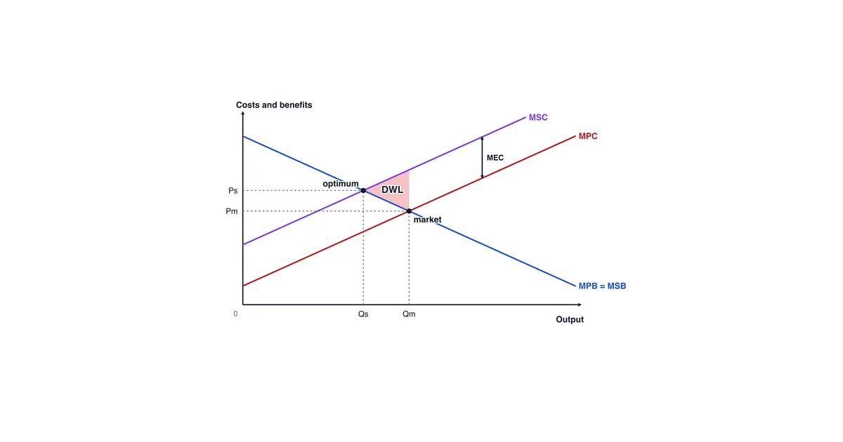
A negative externality is a cost that falls on third parties, so marginal social cost (MSC) lies above marginal private cost (MPC); the free market produces where MPB = MPC, which is more than the social optimum where MSB = MSC, and the triangle between them is deadweight loss.
In words: a downward-sloping curve labelled MPB = MSB (assuming no external benefits) crosses an upward-sloping MPC. A second upward-sloping curve, MSC, sits above MPC; the vertical gap between them is marginal external cost (MEC). The free market settles at Qm, where MPB meets MPC. Society would prefer Qs, where MSB meets MSC, to the left of Qm. Between Qs and Qm, MSC exceeds MSB; that triangle is the welfare lost. The syllabus defines deadweight loss as “the reduction in net benefit to society when output level is not at the social optimum”.

The labelling and shading rules for this and every other syllabus diagram are in the companion H2 Economics diagrams atlas.
How Do Positive Externalities, Public Goods and Information Failure Differ?
These four causes fail in different directions: a negative externality leads to overconsumption, a positive externality to underconsumption, a public good to no provision at all, and information failure to a quantity that is wrong in either direction.
| Cause | Mechanism | Diagram (in words) | Typical correction from the 2.3.3 list |
|---|---|---|---|
| Negative externality | Third parties bear a cost the decision-maker ignores | MSC above MPC; Qm exceeds Qs; deadweight loss to the right of Qs | Tax, tradeable permits, regulation |
| Positive externality | Third parties gain a benefit the consumer ignores | MSB above MPB; Qm falls short of Qs; deadweight loss to the left of Qs | Subsidy, direct provision, public education |
| Public good | Non-rivalry and non-excludability create free riders, so no firm can charge | None required; the market provides zero | Direct provision funded by taxation |
| Information failure | Agents misjudge benefit or cost; asymmetric information brings adverse selection and moral hazard | Not required for asymmetric information | Public education, rules on disclosure |

A Worked Case Study: Congestion on Corridor K (Illustrative Data)
The extract and table below are fictional, written by Ancourage Academy for practice; Corridor K and every figure are invented and describe no real road.
Extract 1. Corridor K is an arterial road into the business district of a dense city. Before Year 2, peak trips were uncharged and each additional car slowed every other vehicle, including buses. In Year 2 the transport authority introduced a peak charge of $1.00, raising it to $2.00 in Year 3. In Year 4, two new residential estates opened along the corridor, car ownership in the area rose, and speeds fell back although the charge was unchanged. A residents’ group said the charge “prices lower-income drivers off the road”. The authority replied that it reviews traffic data every quarter and adjusts the charge to keep traffic moving.
| Year | Peak charge ($) | Cars per peak hour | Average peak speed (km/h) | Bus trips per day (thousands) |
|---|---|---|---|---|
| 1 | 0.00 | 5,200 | 18 | 40 |
| 2 | 1.00 | 4,600 | 27 | 44 |
| 3 | 2.00 | 4,300 | 32 | 46 |
| 4 | 2.00 | 4,500 | 29 | 46 |
The mark tariffs below are Ancourage Academy’s, not SEAB’s; a real case study carries six or seven part-questions totalling 30 marks.
How Would a Strong Answer Tackle Each Case Study Question?
A strong case study answer does what each command word asks, quotes data by year and figure, and saves evaluation for the questions that reward it.
(a) Using Table 1, describe the relationship between the peak charge and cars per peak hour from Year 1 to Year 3. [2] Model answer: As the charge rose from $0.00 to $2.00, cars per peak hour fell from 5,200 to 4,300, an inverse relationship. The fall slowed: the first dollar removed 600 cars, the second only 300. Marks: the trend with figures, then the refinement most answers miss.
(b) Calculate the price elasticity of demand for peak trips between Year 2 and Year 3, and explain what it implies for the charge. [4] Model answer: The quantity change is (4,300 − 4,600) ÷ 4,600 = −6.5%. The price change is ($2.00 − $1.00) ÷ $1.00 = +100%. PED = −6.5 ÷ 100 = −0.065, which is price-inelastic. Remaining peak drivers have few close substitutes or a high value of time, so a further increase removes relatively few cars. Marks: working, sign and value, the term, and a contextual reason. See the elasticity calculations guide.
(c) With the help of a diagram, explain why the market for peak trips on Corridor K fails without a charge. [6] Model answer: Each driver weighs their own fuel and time cost (MPC) against the trip’s benefit (MPB), ignoring the delay each extra car imposes on other road users. That marginal external cost puts MSC above MPC. Without a charge, trips settle at Qm, where MPB = MPC, above the social optimum Qs, where MSB = MSC. The trips between them produce deadweight loss. Year 1’s 18 km/h, against 32 km/h in Year 3, points to this over-use. Marks: the third party, correct curves, Qm and Qs, the welfare loss, one data point.
(d) Discuss whether raising the peak charge further is the best way to reduce congestion on Corridor K. [10] Model answer outline:
- The case for it. The charge raises private cost towards social cost, moving trips from Qm towards Qs; Years 1 to 3 show fewer cars, faster speeds and more bus trips.
- The limits. Demand is price-inelastic (part b). Year 4 shows demand shifting right, so a fixed charge loses effect; MEC can only be estimated.
- The alternatives. Better buses make demand more elastic; a vehicle quota targets car ownership rather than trip timing.
- Equity. The residents’ point is distributional and can be met through the revenue.
- Judgement. Raising the charge is necessary but not sufficient, because inelastic demand and rising car ownership limit what price alone can do.
Marks: two sides, data as evidence, a weighed alternative, and a judgement on “best”.
How Do You Plan an Essay on Correcting a Negative Externality?
Plan the essay around Singapore instruments you can describe accurately, then evaluate each with the same criteria, so the judgement compares like with like. Take a Section A question in the syllabus format: (a) Explain why a free market may produce too much of a good that generates negative externalities. [10] (b) Evaluate the Singapore government’s use of pricing measures to correct negative externalities. [15]
- Part (a). Define market failure in the syllabus wording, draw the negative-externality diagram, and use one production and one consumption example.
- Part (b), paragraph 1: Electronic Road Pricing. LTA describes ERP as “a system used to manage road congestion in Singapore”, and states that “ERP rates are reviewed every quarter and adjusted during the June and December school holidays, based on the traffic conditions at the time.” Analyse it as a charge that tracks the external cost.
- Part (b), paragraph 2: the carbon tax. Written out in full below.
- Part (b), paragraph 3: excise duties. Singapore Customs lists four categories of dutiable goods — “Intoxicating liquors”, “Tobacco products”, “Motor vehicles” and “Petroleum products and biodiesel blends”. For tobacco and liquor, inelastic demand means a duty may change consumption less than the diagram suggests.
- Judgement. Pricing works best when the external cost can be measured and demand responds to price; otherwise regulation or public education carries more of the load. Nudges using “sunk cost fallacy, loss aversion or salience bias”, which the syllabus names, are a further alternative.
What Does a Fully Written Evaluation Paragraph Look Like?
A full part (b) paragraph states the policy, explains its mechanism on the diagram, grounds it in a verified fact, and evaluates it against named criteria before a sub-judgement.
Singapore’s carbon tax corrects a negative production externality by raising the private cost of emitting towards its social cost. Emissions impose costs on third parties that a firm’s MPC ignores, so output settles at Qm, beyond the social optimum Qs; a tax per tonne shifts MPC up towards MSC, shrinking the deadweight loss. According to NEA, the tax applies to industrial facilities with annual direct emissions of at least 25,000 tCO2e, and the rate has risen from $5 per tonne for 2019 to 2023 to “$45 per tonne in 2026 and 2027 with a view of reaching $50 to $80 per tonne by 2030”. The threshold targets large emitters but leaves smaller sources untaxed. The phased rise means a time lag. An efficient rate requires knowing MEC, which is uncertain, so the rate is a signal rather than a precise Pigouvian tax. NEA says the revenue cushions the impact on businesses and households, softening the equity cost. On balance, the carbon tax is best judged as a gradual signal for large emitters rather than a complete correction, leaving smaller sources to regulation.
The paragraph claims nothing about how far emissions have fallen, because no source here measures that.
Which Evaluation Criteria Should Every Policy Judgement Use?
Five criteria cover almost every market-failure policy evaluation: effectiveness, cost, time lag, unintended consequences and information requirements.
| Criterion | Question to ask | Applied to a pricing measure |
|---|---|---|
| Effectiveness | Does quantity actually move towards Qs? | Inelastic demand limits the change |
| Cost | What does it cost to run, and who bears it? | Collection costs; burden may fall on lower-income households |
| Time lag | How long before behaviour changes? | Phased rates and slow equipment changes delay it |
| Unintended effects | What else changes? | Traffic shifts to uncharged roads |
| Information requirements | Can the government measure MEC? | MEC is estimated, so the charge may miss Qs |
Section 2.3.3 pairs policy effectiveness with government failure, where an intervention leaves the allocation worse. For the macroeconomic side of policy evaluation, see the companion guide to Singapore’s macroeconomic policy and exchange rate.
What Are the Most Common Market Failure Mistakes?
Most lost marks in this topic come from mislabelled diagrams and from evaluation that repeats the analysis instead of testing it.
- Labelling the demand curve “D” in an externality diagram. Label it MPB (or MPB = MSB).
- Drawing the wrong gap. For a negative externality, MSC sits above MPC. For a positive externality, MSB sits above MPB.
- Calling inequity a market failure. The syllabus says it is “a distributional issue and not considered a market failure”.
- Treating a merit good as a public good. Education and healthcare are rival and excludable; their case rests on positive externalities and information failure.
See also the secondary-to-JC transition guide and where Economics fits in a JC subject combination.
Common Questions About H2 Economics Market Failure
Do I need to draw a diagram for asymmetric information?
No. The 2027 syllabus 9570 states that “Diagrammatic analyses of factor immobility, asymmetric information, moral hazard and adverse selection are not required.” Explain those ideas in words, with a real example such as insurance or second-hand cars; the two externality diagrams (MSC above MPC, MSB above MPB) are all the syllabus asks for on externalities.
Is market failure tested differently in H1 Economics?
Yes, in scope and format. H1 Economics (8843) is examined by case studies only: one paper of two case studies, 80 marks in 3 hours. Its market-failure section covers public goods, externalities and information failure, and states that knowledge of asymmetric information, adverse selection, moral hazard, market dominance and factor immobility is not required. H2 students need all of them; see the H1 versus H2 comparison. Ancourage Academy also runs H1 Economics classes.
What is non-rejectability in a public good?
Non-rejectability means a person cannot opt out of consuming the good even if they wish to, as with national defence. The 9570 syllabus requires “An awareness of non-rejectability as a characteristic of public goods”, alongside non-rivalry and non-excludability. Mention it, but explain non-provision through non-excludability and free riding.
How should my child practise market failure for the A-Levels?
Draw the two externality diagrams from memory until the labels are automatic, then answer one case study question and one essay part (b) weekly, evaluating each policy on effectiveness, cost, time lag, unintended consequences and information requirements. Ancourage Academy’s JC2 H2 Economics classes and JC Economics programme mark this work against the syllabus; a trial class (usually $18) shows a lesson first.